







How app usability testing helps uncover issues that do not appear during programming.

Why a Developer’s Review Alone Is Insufficient to Judge App Usability
While a developer’s review certainly helps identify technical bugs and issues related to functionality and performance, it cannot—on its own—determine how easy the app is to use for a first-time user.
Developers know the location of every button, understand the purpose of every screen, and grasp the logical flow of functions; consequently, usage steps may seem intuitive to them even when they are confusing to the average user.
Usability testing places the app in the hands of individuals who lack this prior knowledge, thereby revealing a different set of issues unrelated to code integrity.
For instance, a developer might consider the "Complete Order" button perfectly obvious because they know its function, whereas a user might overlook it simply because it is located in an unexpected area of the page.

Navigation Issues Revealed by User Experience
An application’s pages may function perfectly from a technical standpoint, yet users might still struggle to navigate between them or reach their intended destination; this highlights the importance of practical navigation path testing.
When real users test the application without direct guidance, the team can observe whether they intuitively know where to start and where to go next to complete a specific task.
It may become apparent that section names are too similar or that menus are cluttered with excessive options, making it difficult to access the desired service.
The team might also discover that users repeatedly return to the home page because they do not know how to navigate directly to the appropriate section.
In some cases, the issue lies with the placement of the "Back" button or the way menus are displayed, rather than with the underlying code or functionality.
Users might find the progression between process steps illogical, even if the sequence was designed based on the system's internal architecture.
Usability testing makes these difficulties visible, as the team can observe moments of hesitation firsthand, rather than simply checking code and verifying that links work.
It allows for the tracking of pages that take users a long time to comprehend, as well as pages from which they frequently retreat without completing the task.
This data helps designers restructure navigation paths for greater clarity and reduce the number of decisions users must make while using the application.
Identifying registration difficulties before they lead to user churn
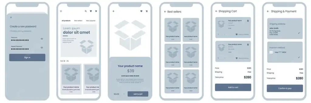
To the development team, the registration process may seem straightforward—consisting merely of fields, buttons, and validation logic governed by specific rules—but users often perceive it quite differently.
Usability testing reveals whether a user can easily create an account or if they get stuck due to an excessive amount of required data or a lack of clarity regarding why certain information is being requested.
The team might discover, for instance, that users are unaware of the required password format until an error message appears, forcing them to make multiple attempts.
Issues may also arise from a failure to clearly indicate mandatory fields or a lack of sufficient guidance on what data should be entered into specific boxes.
Testing might further reveal that users are unsure whether a verification code has actually been sent or where to enter it once it arrives.
These issues do not necessarily indicate a technical bug in the registration system; rather, they suggest that the way the process is presented to the user needs improvement.
The team might also find that mandatory registration is prompted too early—before the user has had a chance to appreciate the application's value and utility.

Input errors that arise when a real person uses the application
Even after verifying that application fields accept valid data and reject invalid data, issues regarding how users actually input information may persist—issues that are not easily detected during technical testing.
Usability testing reveals how people actually interact with fields: do they know the required data format before they start typing, or do they only discover the rules after making a mistake?
Users might struggle to determine the correct format for entering a phone number—such as whether to include a country code or omit certain symbols.
They may also face difficulties entering dates or selecting times if the display format differs from their usual expectations.
The team might discover that the keyboard obscures a critical part of the screen, preventing the user from seeing the input field or the "continue" button while typing.
Such issues relate to the user experience rather than the technical validity of the data validation process.
It may also become apparent that error messages fail to clearly explain what needs to be changed for the data to be accepted.
For instance, a generic error message might force the user to experiment with various possibilities before identifying the actual problem.
Usability testing allows the team to witness these moments firsthand and observe the time it takes for the user to comprehend the message and correct the data.
Testing can also reveal that certain fields request information the user deems unnecessary, prompting them to question why such data is required.
This can lead users to abandon the form before completion, even if all fields function correctly from a technical standpoint.
Through testing, the team can reduce the number of fields, optimize their layout, or add illustrative examples that help users enter the correct data on their first attempt. It is also possible to determine whether navigating between fields is easy or requires numerous, unnecessary keystrokes.
Another issue may arise when a user moves to a new field without realizing that the previous field contains an error preventing them from proceeding.