


Steps that make the user confident in entering their card details within the application

Transparency in the Payment Interface is Key to User Trust
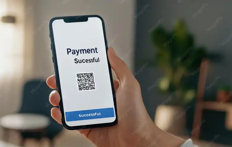
When a user decides to enter their card details into your app, they are giving you a piece of their trust, and that trust isn't easily earned. The design of the payment interface should be clear and straightforward, free of complexity or ambiguity. Every word and every visual element on the page should reassure the user that they are in a secure environment. Displaying the security system's logo, such as "Secure Payment" or "Encrypted by SSL," creates an immediate impression of reliability. It's also important to explain to the app how financial data is handled simply, such as "We will not store your card information." These concise statements alleviate a significant portion of user anxiety. Using neutral background colors and clear text contrast also enhances comfort during the payment process. Some smart apps even include a "View Details" option so the user can review the amount before it's deducted. This simple step translates into a sense of professionalism and attention to detail. On the other hand, the data entry process should be quick and easy, without requesting unnecessary information. Users dislike complexity, and every extra field can be a step towards hesitation. The payment page design should also be compatible with all devices to ensure a seamless experience at all times. Upon completion, an immediate notification should appear confirming the successful transaction, along with the transaction number and contact information for any inquiries. All these small touches make a significant difference in the user's sense of security. Trust isn't built on promises, but on a clear and comfortable experience that makes them feel in control.
Visual Security: How Design Speaks the Language of Trust
Before a user reads a single word on a payment page, their eyes capture the visual messages that determine their initial impression. Therefore, the design of a payment interface is not merely aesthetic; it's a carefully constructed visual language of security. When a user sees familiar security symbols like padlocks or bank logos, their mind begins to form a sense of reassurance. Color choice plays a crucial role here. Blue suggests trust, green symbolizes security and success, while unsettling colors like dark black or excessive red should be avoided. Displaying the logo of a recognized financial institution enhances credibility, especially if the user is already familiar with it. Furthermore, prominently displaying the phrase "Your data is encrypted and protected by global standards" instills a sense of security without requiring lengthy explanations. Small details like the organization of fields and input spacing contribute to a professional impression. Successful payment applications leave nothing to chance; they design every element to convey an immediate message of reassurance. Even temporary messages during transaction processing, such as "Card Verification," demonstrate the system's seriousness and commitment to verification. It's also important that the interface includes a simple link explaining the privacy policy. This gives users access and a sense of control. Visual security design isn't about excess, but rather a balance between simplicity and clarity. Users trust interfaces that convey clarity, not those that overwhelm them with details. Ultimately, smart design doesn't say "trust us," but makes you feel it without words.

Clear Explanations: Your Path to Eliminating Card Entry Fear
One of the biggest reasons users hesitate to enter their card details in an app is ambiguity. Therefore, clear and simple explanations at every step of the payment process are essential for building trust. When users understand what's happening and why, doubts disappear, and reassurance takes hold. At the beginning of the payment page, the app can explain with a short message that "Your information is encrypted for your protection." This simple statement is enough to completely transform the user experience. The explanation should be written in user-friendly language, avoiding technical jargon. It's also important to explain why each piece of information is requested, such as "We only need your card number to complete the payment." This kind of transparency makes users feel that the app isn't hiding anything. A short page titled "How do we protect your data?" can also be added, containing a simple explanation of the security mechanism used. The design of this page should be sleek and uncluttered, so the user doesn't feel bored or anxious. Some apps also add a small explanatory icon next to each field, which can be clicked to read a brief explanation. These small touches make a significant psychological difference. A user who understands the steps feels in control of their experience, while ambiguity breeds hesitation. After data entry, the user should receive clear confirmation that the process was completed securely, along with a reassuring message that the information was not stored. All of this builds trust and makes the user more willing to use the application again. Trust is not a promise you make; it's a clear, step-by-step experience the user goes through.

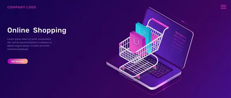
A user-friendly checkout interface is key to building trust with every click.
Peace of mind during checkout is more important than any promotional offer. When a user feels the checkout interface is simple, organized, and clear, they complete the process without hesitation. Therefore, the design of the checkout interface should prioritize smoothness at every step. It's best to have clearly defined fields and buttons in calming colors that indicate the correct direction, such as "Proceed to Checkout" or "Return to Cart." Avoid excessive visual details, as every unnecessary element can be distracting or cause anxiety. Add small touches to reassure the user, such as a padlock icon or the word "Secure" next to the card entry field. It's also crucial that the final total is displayed clearly without hidden fees, as price surprises immediately undermine trust. A good checkout interface makes the user feel in a familiar space, as if they were shopping at a trusted store they're used to. Don't forget that clear fonts and ample spacing between elements make the experience more comfortable and easier. Even the page's response time plays a role in building a sense of security; processing delays can raise suspicions. In short, the design of the payment interface is not just a visual arrangement, but a feeling of security from the first moment until order confirmation. Every click within it is a signal of trust, and every detail is a step towards long-term loyalty.