Your app is the face of your company. How to design an interface that reflects your brand identity.

The Importance of First Impressions in App Interface Design
The app interface represents the digital branch of your company, and therefore it must carry a consistent signature with your brand's visual identity. From colors, to fonts, to icon styles, all elements must be in line with your company's personality. Is your company modern and geared toward the younger generation? Then, bright colors and a bold design may be appropriate. If you represent a luxury brand, you may prefer dark colors and a sleek, minimalist design.
Attention to fine detail in design gives users indirect signals about your company's professionalism. If buttons are misaligned or colors are distracting, this may suggest a lack of seriousness or a weak internal organization. Conversely, a well-crafted design conveys confidence and brand strength.
Therefore, before launching your app, ensure that its interface accurately reflects your vision. Hire a designer who understands how to translate your brand's values into visual elements. Always start with the most important question: "What do I want the user to feel when using my app?" Because this feeling is the beginning of the relationship between you and them.

The Role of Fonts in Expressing Brand Personality
When it comes to designing an app interface that reflects your company's identity, choosing a font is one of the most influential factors, despite its apparent simplicity. A font is not just a way to display text; it's a visual tool that conveys the brand's tone and determines how the user receives the message.
Formal fonts, such as Helvetica or Roboto, convey a sense of professionalism and organization and are suitable for apps focused on services or technology. Meanwhile, handwritten or circular fonts convey a sense of friendliness and simplicity and may be suitable for apps aimed at children or creative brands.
It's important that the fonts used in your app reflect your company's core identity. If your company has a luxurious and sophisticated feel, you might choose an elegant, thin-line font. If you're targeting a young, active audience, choose a modern font that aligns with this style.
Another important aspect is font legibility. Regardless of aesthetics, the font should be clearly legible on all screen sizes. A great interface design is worthless if the user can't easily read the headings or menus.

Designing Icons to Reflect Your Brand Identity
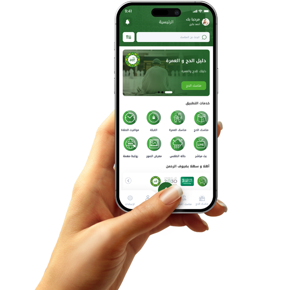
Icons in an app interface aren't just visual elements for ease of use; they're a visual language that expresses the app's personality and the identity of the company behind it. Each icon should convey a clear meaning while also reflecting the overall spirit of the brand.
If your brand is modern and innovative, choose icons with simple, modern lines, perhaps in a flat or minimal style. If you represent a more classic or luxurious brand, you might be more suited to using icons with fine details or a subtle 3D touch.
Icons are used in every part of the app: in the main menu, navigation bar, settings screen, and even within messages and notifications. Therefore, maintaining a consistent design style is crucial. Using icons of different styles can give the impression of unprofessionalism or visual confusion.
Don't forget to maintain consistency in size and spacing between the icon and the text. For example, if the icon is too small compared to the text, it may lose its impact. If it is too large, it may be distracting. Therefore, it is necessary to visually test them to ensure balance.

How does the user experience (UX) reflect your company's values?
When designing an app that represents your brand, it's not enough for it to simply look attractive. The user experience (UX) itself must reflect your company's core values. UX is the foundation that determines how the user feels while using the app and how smoothly they interact with the interface and functions.
If your company focuses on simplicity and clarity, the app experience should be free of complexity, with straightforward interfaces, clear buttons, and easy-to-understand navigation paths. If your brand promotes excellence and luxury, the user should feel this in every detail of the app, from the way you navigate pages to subtle animations.
A good user experience demonstrates your respect for the user's time and your attention to their needs. For example, reducing the number of steps required to complete a purchase or registration process demonstrates appreciation and care, making the user see that you are a company that cares about the comfort of its customers.


