

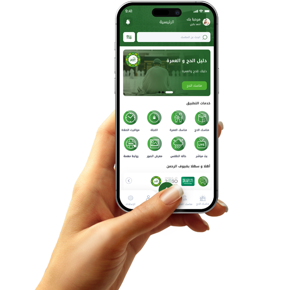


Successful application starts from the section selection screen.
Choosing categories first is a small decision that can have a big impact on the app's success.
In the world of apps, every small detail can make a big difference. One of the most important, yet often overlooked, details is the category selection screen at the start of the app. While some may see it as a simple step, it is actually a pivotal moment in the user experience. Choosing categories gives the user a sense of control and directs them directly to what interests them without having to search and experiment.
Giving the user the option to select their preferred categories from the first use of the app creates a positive impression and makes the app feel as if it was designed specifically for them. This sense of personalization is what distinguishes successful apps that achieve long-term engagement.
Apps that pay attention to this step often have high retention rates. Users don't waste time on irrelevant categories; they find what they want in seconds. Whether it's a shopping, educational, or entertainment app, structuring the experience based on user preferences increases engagement and increases the chances of conversions and sales.
How the section selection screen paves the way for an exceptional user experience
When a user begins their experience with any app, they have only two choices: either feel comfortable in the first minute and continue, or get distracted and quickly abandon the app. This is where the section selection screen comes in, serving as the first gateway to intelligent and organized interaction.
The basic idea of the section selection screen is to guide the user towards what interests them from the start, rather than letting them randomly navigate the app's content. For example, if the app offers a variety of products or services, allowing the user to select what suits their interests saves them time and effort and gives them a sense of control.
Psychologically, the user feels that the app responds to them personally, not just displays generic content. This type of personalization strengthens the user's connection to the app and increases the likelihood of them returning to use it later.
This screen also helps organize data and optimize content presentation, allowing developers to deliver the most relevant content to each user based on their preferences. This not only improves the user experience but also increases engagement, click-through rates, and in-app purchases.

The section selection screen is the gateway to a personalized experience that makes the user feel like they're the center of the app.
One of the most important secrets to successful apps is making the user feel like they're the center of the experience, and that everything they see is designed specifically for them. This is precisely where the power of the section selection screen shines, paving the way for a personalized user experience from the first moment.
When you first open an app, nothing suggests interest in the user more than asking them what they prefer. Giving them the opportunity to choose the sections they're interested in makes them feel like the app is listening and gives them the space to customize their experience. This gesture reinforces the user's sense that the app thinks like them.
Category selection serves not only the user, but also the app itself. Instead of offering generic content that isn't suitable for everyone, the app can organize content more efficiently, improving browsing speed and increasing engagement. This organization also provides an ideal opportunity to display relevant ads or promotions.
For example, in an app that showcases products, articles, or videos, this step helps reduce distractions and improve focus on what interests the user. This increases the rate of content discovery and, consequently, the value of the time spent within the app.

Often, users don't pay attention to the small details that shape their in-app experience, but they are subconsciously influenced by them. One of the most prominent of these details is the section selection screen, which, despite its simplicity, plays a crucial role in building long-term user loyalty.
When a user feels that an app understands them and offers them content that aligns with their interests, this generates a sense of comfort and belonging. These feelings are the foundation of digital loyalty. The section selection screen creates this feeling from the first moment, by allowing the user to identify what they are looking for without being forced into a specific path.
This early personalization makes the user experience more efficient and reduces the frustration of random browsing or accessing inappropriate content. The result? A user who returns to the app more often, engages with the content more seriously, and recommends it to others.
Furthermore, this screen represents a starting point for gathering extremely useful data about user preferences. This data can be used to improve the user experience later, develop new features, and even enhance inbound marketing strategies.
From a design perspective, it's important that the screen is attractive without being complicated. Section options should be clear and straightforward, and easily editable later, as user interests may change over time. The more flexible the editing experience, the more confident the user will be in the app.