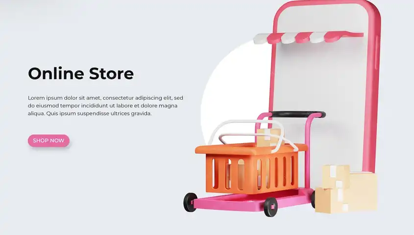


Online fashion store app attractive design elements

An elegant interface that reflects the brand's identity
When opening a fashion app, the first impression is crucial. The interface design should not only be beautiful, but also reflect the brand's personality, whether luxurious, youthful, modern, or classic. The use of colors, fonts, and even buttons should be consistent with the brand's spirit.
For example, a luxury fashion brand might prefer to use dark colors with gold accents, while younger brands might choose vibrant colors. The logo should be clear and prominent in the interface, with the ability to return to it from any page within the app.
Also, the elements on the home screen should be arranged in a way that invites discovery. Images of offers, new sections, or sales should be displayed attractively, but without clutter. Each element should have enough space to stand out elegantly.
The home screen should give the user a sense of welcome and ease, with clear login buttons and a simple browsing experience without the need for prior registration. It's also ideal to have a special section for best-selling products or recommendations based on user preferences.

A Smart and Seamless Shopping Cart Experience
The design of the shopping cart within a fashion app isn't just a final step; it's a vital part of the user experience and can be the deciding factor between completing a purchase or abandoning it. Therefore, this page must be carefully thought out.
First, the cart icon should always appear at the top of the app, with the number of products always visible to remind the user of what they've added. When clicking on the cart, brief details about each product should appear: name, image, size, quantity, and price.
A smart element of the cart design is the option to easily modify the quantity or delete a product, without having to return to the product page. It's also preferable to display suggestions for similar products below the cart to increase the chances of additional purchases.
Also, the cart page design should support automatic total calculations, taking into account discounts and shipping costs. Every change to the product should result in an immediate price update.
The option to save the cart for later or "add to favorites" allows users who aren't ready to purchase to stay engaged. The basket can also be linked to the user's account to be saved when logging in from another device.

Choosing Fonts and Colors: A Visual Language That Speaks of Elegance
Fonts and colors are not just design elements; they represent a visual language that expresses a store's identity and directly influences the user's feelings and attraction. In fashion retail apps, these elements are used carefully to reflect taste, target audience, and even luxury.
First, when choosing colors, they must be harmonious and consistent with the brand's style. If the store is luxurious, black, white, gold, or gray are preferred. For youthful or modern brands, bright or neon colors may be appropriate.
Colors are also used to highlight important elements such as purchase buttons, offers, or promotional messages. However, it is preferable to limit the color palette to three to four primary colors to maintain simplicity and avoid confusion.
As for fonts, they should be easy to read and clear on different devices. The heading font should be prominent and attractive, while the detail font should be soft and of an appropriate size. Decorative fonts should be used sparingly and are best reserved for logos or headlines only.

Fonts should be easy to read and clear across devices. Title fonts should be bold and attractive, while detail fonts should be soft and of an appropriate size. Decorative fonts should be used sparingly, preferably for logos or headlines only.
Contrast between the font and background should be considered. Light text on a light background or dark text on a dark background reduces legibility. This negatively impacts the user experience and may cause them to abandon the app.
It's also best to use the same font across all app pages to maintain a unified identity. A simple artistic touch can also be added to offer titles or section names, without going overboard.