

How to choose your app's colors to increase customer trust and speed up the purchase decision
The Architecture of "Sovereign Blue" and the Engineering of Digital Trust
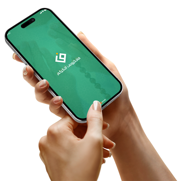
At Grand, we start with a scientific fact: Navy blue is the color frequency most associated with "reliability and security" in banking and technology systems. When designing an application that requires financial transactions or sensitive data in the Kingdom, we adopt this color as a fundamental basis for enhancing the "trust protocol" for the user. This choice is not arbitrary; rather, it aims to reduce the stress hormone associated with digital payment processes, making the customer feel they are within a "safe environment" similar to the walls of major banks. This paves the way, both programmatically and psychologically, for completing the purchase without fear of fraud.
The Physics of Contrast and Directing the Eye Towards the Purchase Button
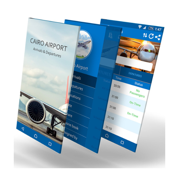
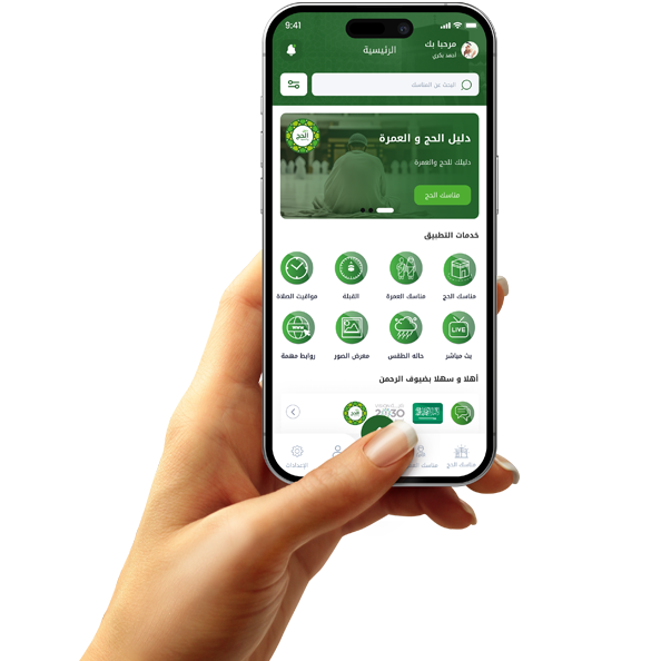
Grand's visual architecture is based on the principle of "visual hierarchy." We use neutral background colors to allow "stimulating" colors, such as orange or emerald green, to stand out in the action buttons ($Call to Action$). Choosing green, for example, in the "Sahil" or "Grand" apps for the "checkout" process sends a programming signal to the brain that "the road is safe," while orange stimulates the "urgency" region, thus accelerating the immediate purchase decision. This carefully considered contrast ensures that the customer's eye doesn't get lost in visual clutter and is directed straight to the project's final objective.

Localization of Color Palette:
In a market like Saudi Arabia, colors have deep cultural connotations that Grand respects in its design code. Using "royal green" or "soft gold" evokes a sense of luxury and high quality, which is what the Saudi consumer will be looking for in 2026. We design interfaces to align with these cultural preferences, integrating them with "Dark Mode," which conserves battery power and reduces eye strain. The connection between "technological modernity" and "local identity" is what transforms a tech brand (like 3M) from a mere app into a familiar and engaging entity for users.
Visual Security and Accessibility Compliance:
Grand's engineering excellence lies in its commitment to "digital inclusivity." We don't choose colors solely for aesthetics; we programmatically test them to ensure compliance with the WCAG (World Wide Web Accessibility Agencies) standards for the visually impaired or colorblind. Using clearly contrasting colors ensures that every customer, regardless of their visual condition, can read product details and understand the payment process. This "visual security" expands your customer base and demonstrates the company's professionalism. Great software respects all its users, which positively impacts app ratings in app stores and enhances brand value in the market.