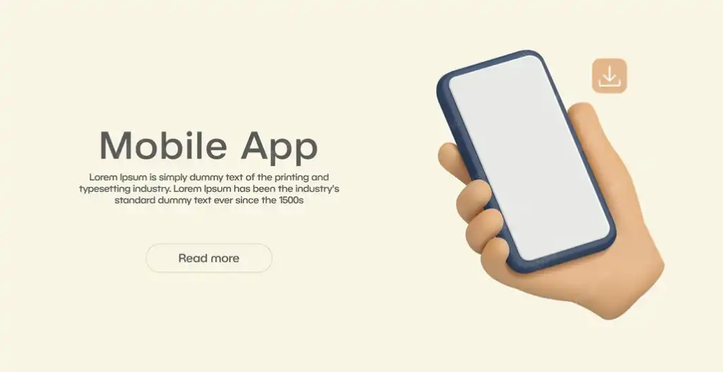


Don't start marketing before you make sure the app design is professional.

The first 10 seconds of use determine the success of a campaign.
Imagine a user sees your ad, is attracted to the concept, and then enthusiastically downloads the app. What happens during the first 10 seconds of opening it? These moments determine whether a marketing campaign actually succeeds or fails.
If a user enters an app that is slow, has a disorganized design, or contains confusing elements, they will likely close it and never return. However, if they find a smooth, clear, and engaging experience, they will continue, and this is where real success begins.
Companies that understand the relationship between marketing and design are inseparable. They see the first visual and interactive impression of an app as an extension of the ad that initially attracted the user.
Therefore, it is essential to test the initial experience in the app repeatedly. What does the first thing the user sees look like? How many steps are they taking to reach their goal? Do they feel confident? Do they understand what they need to do?

An unclear app makes the user hesitate and leave.
One of the biggest mistakes that ruins marketing results is for a user to land on an app they don't understand. The idea may be excellent, but if it isn't clearly defined within the design, its value is lost. Users don't like to "search" for benefits; they want to see them immediately.
Professional design means that the user experience is understandable, the steps to access the service are clear, and the options are organized. When the user enters the app, they should automatically know what to do, without complicated explanations or instructions.
Excellent design firms focus on building interfaces that guide the user calmly. Clear buttons, simple phrases, understandable icons, and smart navigation paths are what keep the user engaged after clicking on the ad.

Random design erodes user trust in seconds
When a user accesses your app through a paid ad, they arrive with high expectations. They expect to see a professionally designed, organized, and easy-to-use app. If they encounter a random design, inconsistent colors, or a cluttered interface, their first thought is: "This app is unreliable."
Trust isn't built solely on the service or idea, but on the design itself. Design is what makes the first impression, and first impressions don't last. Today's users are more discerning, comparing apps, and easily distinguishing between professional and amateur work.
Poor design not only affects user perception, but also makes interaction difficult, leads to errors, and increases the rate of deletion after installation.

A professional user interface complements the ad's message.
A good ad creates promises: ease, speed, discounts, or excellent service. But once the user accesses the app, they must find these promises embodied in a professional user interface that confirms what they saw in the ad.
Consistency between the ad and the design is key to success. If the ad talks about a simple experience, the user shouldn't find the app complex or confusing. This inconsistency immediately undermines trust.
Professional design companies ensure that the app's identity is consistent with the ad's style, in terms of colors, language, and content presentation. The goal is for the user to feel like they're in the same environment that first caught their attention.
User interface design isn't just about aesthetics; it's also about clarity. Where does the user find the feature mentioned in the ad? How can they easily access it? All of these elements should be considered before marketing.