


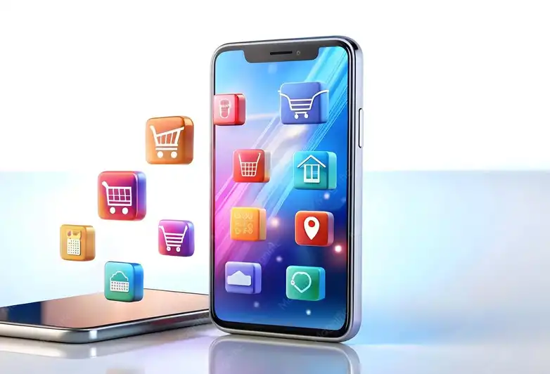
Design the “Add to Cart” button in your app to be visible without scrolling.

Improving the "Add to Cart" Button Design to Increase User Engagement
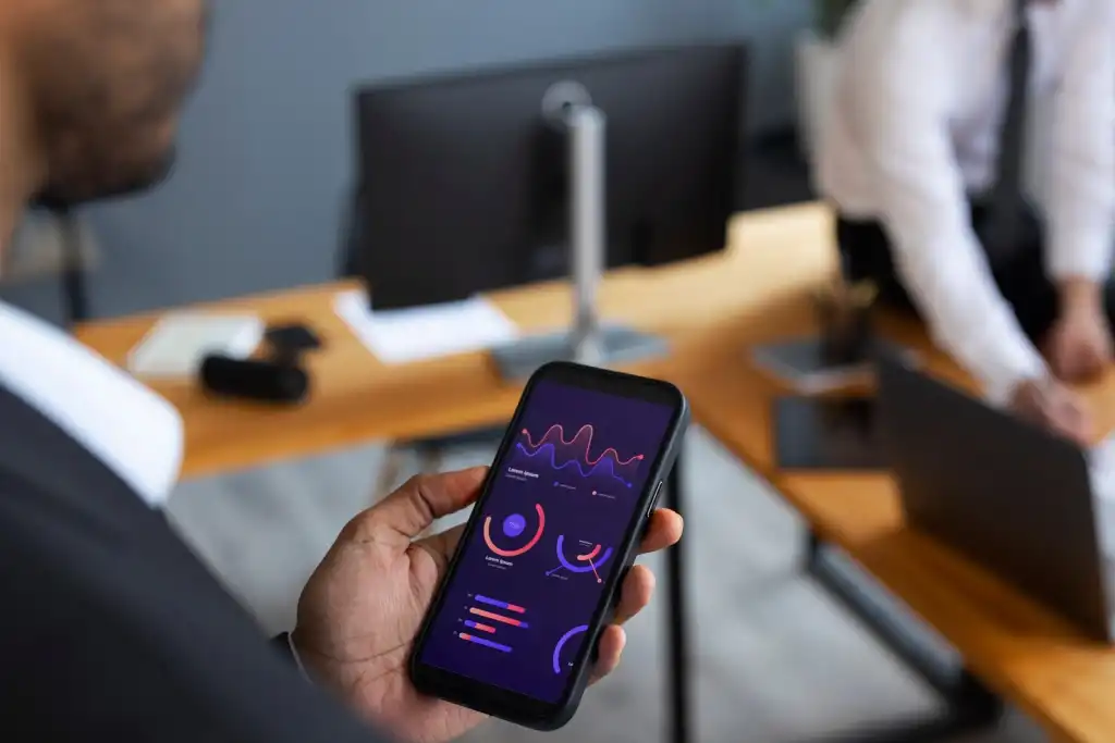
When designing commercial or marketing applications, the "Add to Cart" button represents the primary point of user interaction. To ensure it remains visible without scrolling, designers must consider how to integrate this button intelligently into the user interface.
One effective strategy is to use a "fixed design," where the "Add to Cart" button remains in place on the screen while scrolling. This can be achieved using a fixed floating bar at the bottom or top of the screen. This approach does not disturb the user and makes it easy to add products to the cart at any time during browsing.
The button should also be clear and stand out from other elements with attractive colors that are consistent with the brand's identity. However, care must be taken when choosing colors so that they do not clash with the background colors or other text. The font used for the text within the button should be easily readable.

Responsive Design for the "Add to Cart" Button Across Different Devices
A key goal in app design is to ensure that the "Add to Cart" button is responsive across different devices. This is not limited to mobile phones; it should also be compatible with tablets and larger screens such as desktop computers.
On smaller devices, such as smartphones, the button should be positioned firmly at the bottom of the screen to remain visible when scrolling. It is also preferable to make the button slightly larger so that it is easier to click with the thumb. On tablets, the button can be placed in an area that the user can easily reach with one hand.
On desktop computers, the button can be placed prominently at the top of the screen or below the product image, ensuring it is always accessible when scrolling. The larger the screen, the more space it takes to accommodate the button while maintaining good spacing between it and other content elements.

Using Animation to the "Add to Cart" Button to Improve Engagement
Adding animation to the "Add to Cart" button can be an effective way to grab the user's attention and encourage them to take quick action. When the button is designed with smooth animation or tap effects, user engagement is naturally increased. These effects can be simple, such as resizing or a moving effect when the button is tapped, which helps confirm the user's engagement.
Using animation also helps motivate the user to complete the purchase. For example, when adding a product to the cart, a simple transition effect can appear as the product appears in the cart. This not only makes the user feel successful, but it also enhances the emotional connection. Adding animation makes the button appear more dynamic and encourages the user to continue interacting with the app.
It's important that the animation is not overly exaggerated, so it doesn't slow down performance or distract the user. The movement should be smooth and fast enough to maintain ease of interaction with the app without impacting performance.
Adding Sound Effects When Clicking the "Add to Cart" Button
One technique that can enhance the user experience when clicking the "Add to Cart" button is adding a soft sound effect when each item is added. The sound effect can be as simple as a soft tone or a confirmation sound for the user upon successful addition.
Sound effects help create a sense of accomplishment, as the user feels they have completed a step in the shopping process. These effects are particularly effective in apps that focus on sensory user interaction, such as online shopping apps.
It is important that the sound effects are not obtrusive or overly repetitive, as they can be annoying if used excessively. It is best to have a temporary, calm tone so as not to disrupt the user's browsing experience.
Customizing the "Add to Cart" Button to Match the App's Identity
One of the most important things when designing the "Add to Cart" button is to customize it to reflect the app's identity. The button should be part of the overall design of the app and should match the colors and shapes used in all user interface elements.