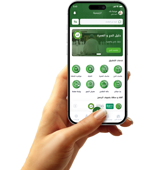
Coordination of application and website content is one of the reasons for their success

Using unclear or inappropriate fonts
One of the design mistakes that directly impacts the user experience is choosing inappropriate fonts, whether in terms of shape, size, or color. Fonts are the medium through which content is conveyed, and if they are difficult to read or uncomfortable to the eye, the message, no matter how useful it may be, is lost.
Many designers are drawn to decorative or unusual fonts to attract attention, but what they fail to realize is that users seek clarity first. When words are not easily legible, users begin to feel frustrated and may immediately exit the application or website.
Size also has a significant impact. Very small fonts strain the eye, while excessively large fonts take up space and disrupt the design's balance. Colors, on the other hand, must contrast well with the background to ensure legibility in all lighting conditions.
Websites that contain multiple fonts on the same page lose visual cohesion and appear haphazard and unprofessional. Therefore, it is always advisable to use a limited number of fonts (usually two: one for headings and one for body text) while maintaining consistent formatting.

Over-reliance on images without balance with text
Many apps and websites make a common mistake: over-relying on images to convey messages, at the expense of explanatory text. While images are visually appealing and powerful, ignoring textual information leaves a gap in understanding and affects the clarity of the message.
Images alone don't always explain what's meant to be said. An image may convey an idea, but it leaves the user wondering about the details, how to benefit from it, or what to do next. Good text complements the image and guides the user to the next step.
On the other hand, images consume time and data to load, especially on weak internet connections. Without text alternatives, the content becomes inaccessible to many users, which can lose you important audience segments.
Also, over-reliance on images can harm search engine optimization (SEO), as search engines rely heavily on text to understand the content of a page. Sites lacking textual content suffer from poor search engine rankings.

Ignoring User Experience (UX) During Design
One of the biggest mistakes made in app and website design is neglecting the user experience (UX) and focusing solely on aesthetics. Successful design isn't just about colors and patterns, but how the user interacts with every part of the platform.
User experience includes many factors: Can the visitor easily find what they want? Do they know where to click? Do they feel comfortable while browsing? Are they facing difficulties or unnecessary steps? All of these questions should be addressed in the early stages of design.
The problem arises when an app or website is built based on the designer's taste or the project owner's desires, without taking the actual user into account. This results in a complex design, filled with unnecessary options, or long registration steps that confuse the user.
Also, ignoring user feedback and not testing the design with them deprives the project of the opportunity for early improvement. Design should evolve based on real feedback, not assumptions.

Overusing Colors and Visual Effects
A common mistake many developers and designers make is overusing colors and visual effects such as shadows, animations, and reflections. These embellishments may seem like they give an app or website a professional look, but in reality, they can confuse the user and weaken the clarity of the message.
Good design isn't measured by the number of aesthetic elements, but rather by its simplicity and effectiveness in conveying information. The average user doesn't care much about whether buttons shine or move, as much as they care about finding what they're looking for quickly and without distraction.
When colors are overused without a clear purpose, it becomes difficult for the eye to distinguish between primary and secondary elements. Worse still, some colors can clash, creating an uncomfortable experience that can cause the visitor to abandon the app.
Also, heavy visual effects affect loading speed, especially on phones with limited capabilities, and they overburden processors and impair performance. This reduces user satisfaction and increases the likelihood of them abandoning the app.


