Common errors in application design and how to avoid them

First: Complex and difficult-to-use interfaces
One of the most common mistakes we see is that the app interface is complex and difficult for the user to understand quickly. Many designers try to cram all the options and features into the first screen, which confuses the user. This makes the user experience annoying and uncomfortable, especially if the user is new to the app. To avoid this mistake, your design should be simple and easy, so that the user can navigate easily without having to search for options. The focus should be on providing the information the user needs at the right moment, in an organized and easy way, while avoiding cluttering the screen.
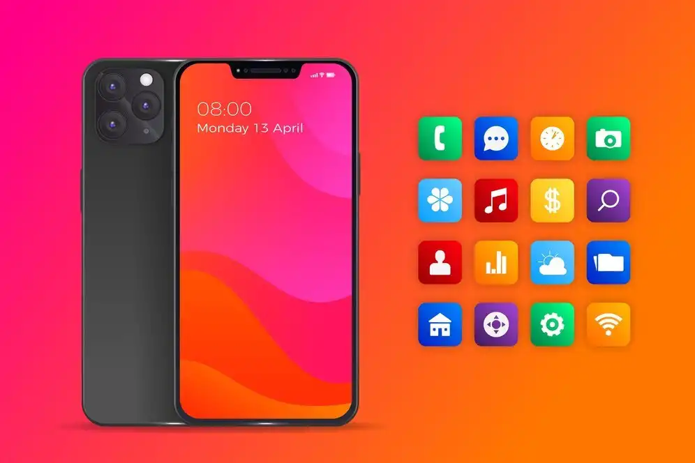
Second: Neglecting compatibility with different screen sizes
Some applications are excellent on a specific phone, but when you try them on a device with a smaller or larger screen, things become confusing and the interface becomes inconsistent. This mistake is very common, especially in applications that are not tested on more than one device. The solution is to make sure that the design is responsive, meaning that it adapts to different screen sizes smoothly. You must pay attention to the dimensions of buttons, texts, and images to be suitable for any device the user uses. And pay attention to designing elements so that they are flexible and move naturally on different screens, whether mobile or tablet.
Third: Ignoring usability tests
Sometimes, the designer is enthusiastic and thinks that his design is excellent without testing it on users. This is a big mistake, because problems may appear that you do not expect until you see actual users using the application. Real users usually face unexpected difficulties, such as difficulty understanding some icons or navigating between pages. To avoid this mistake, you must conduct usability tests periodically before launching the application. These tests help you identify the problems that users face and solve them before they spread and cause negative reactions.
Fourth: Neglecting application performance
One of the things that annoys users the most is slowness and hanging. No matter how beautiful the design is and the user interface is excellent, if the application is slow or hanging, users will quickly delete it. This mistake often results from adding a lot of heavy elements such as high-quality images or complex movements without paying attention to performance. To avoid this problem, the designer must balance between the beauty of the design and the speed of the application. Use compressed images and try to reduce the extra movements that may slow down the application. In addition, do not forget to improve the speed of loading pages and reduce the consumption of device resources such as battery and memory.

Fifth: Not providing a consistent user experience
Successful applications depend on a consistent user experience across different screens and devices. Some designers make the mistake of designing radically different elements between pages, which confuses users and complicates the experience of navigating between them. It is important to maintain a specific style for visual elements such as buttons, menus, and colors, so that the user gets the impression that each part of the application is related to each other. Providing a consistent experience increases comfort and ease of use, and helps create a smooth and comfortable experience.
The role of Grand Information Technology Company
To ensure that your application is free of these errors and you get a distinctive design, it is best to deal with experts in application design and development. Grand Information Technology Company is one of the leading companies in Saudi Arabia in the field of application design and development. We have a team specialized in providing integrated technical solutions, starting from designing user interfaces to testing the application and ensuring its compatibility with different devices. In addition, we are keen to improve application performance and provide a consistent user experience, which ensures that the application is fast and easy to use, and meets the needs of users in an excellent way.


