


How to choose your app's colors to double your sales
The Psychology of Primary Colors and Their Purchasing Influence
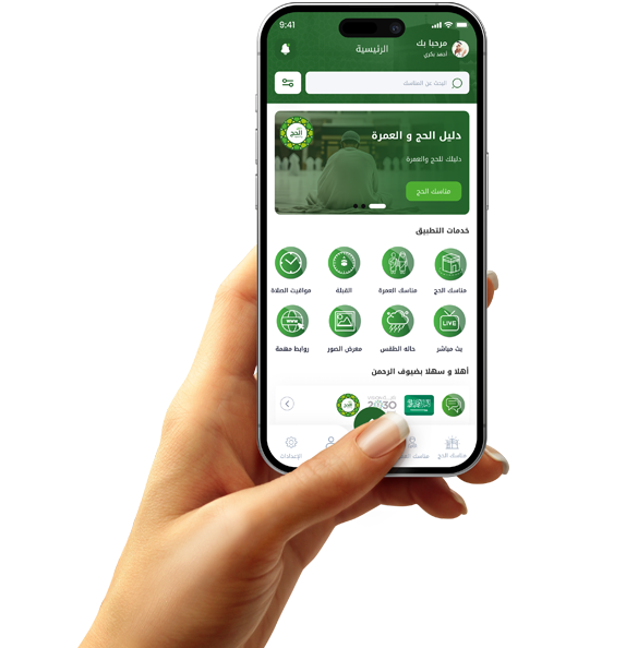
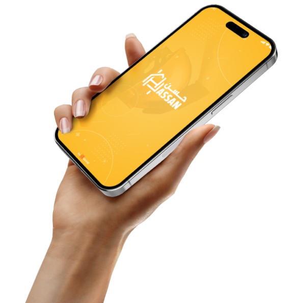
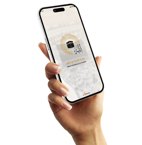
Each color sends an immediate message to the brain. Blue, for example, is the "king of trust," which is why it's used in banking apps and by large tech companies because it gives a sense of security. Red and orange, on the other hand, stimulate adrenaline and create a feeling of urgency and hunger, making them ideal for restaurant apps and limited-time offers. At Grand, we first analyze your business type. If you sell luxury products in Saudi Arabia, we go for royal green or black with gold. If your app is educational or a service-oriented app in Egypt, we choose colors that convey positive energy and clarity, like sky blue or calming mauve.

The 60-30-10 Rule for Professional Visual Balance
To prevent your app from becoming cluttered and straining the user's eyes, we apply a universal geometric rule for color distribution. 60% of the color is allocated to the primary color (usually white or very light gray), which represents the background and empty spaces. 30% is allocated to the secondary brand color that distinguishes your pages and menus. The remaining 10% is the "sales secret," where we use a very contrasting accent color and reserve it only for important buttons like "Buy Now" or "Add to Cart." This contrast automatically draws the customer's eye to the desired location.
Dark Mode Design and 2026 Standards
By 2026, dark mode will no longer be a luxury; it will be a standard feature for most users to save battery and reduce eye strain in low light. At Grand, we don't just invert colors; we re-engineer contrast to ensure clarity and prevent eye strain. We use deep blacks with off-white text to minimize glare. The smart design of dark mode encourages customers to spend more time comfortably within your app at night, resulting in a greater chance of making additional purchases.

A/B Testing and Results Analysis
At Grand, we don't guess; we experiment. Sometimes we create two versions of the app, one with a green "push" button and the other with an orange one, and see which one generates more sales. The data determines the final color. We also pay close attention to accessibility, meaning the colors must be clear even for people with color vision problems or slight visual impairments. When you pay attention to these details, you open your app to all segments of society and build a reputation as a brand that "cares about every customer," which is what allows you to dominate the market and actually multiply your profits.