


أسرار تصميم واجهة التطبيق UI UX التي تجعل المستخدم لا يغادر تطبيقك
The Law of Cognitive Simplicity: “Don’t Make Me Think”
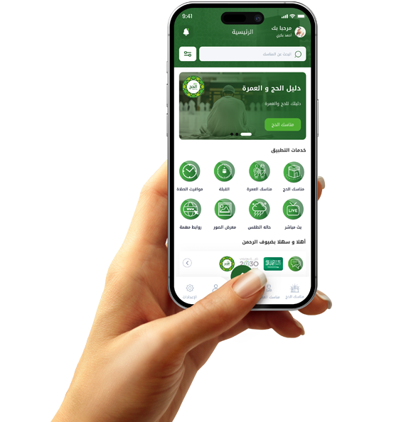
The most important UX secret for 2026 is minimizing user mental effort. Once a user opens an app, they should know “Where am I?” and “What am I doing now?” without thinking. Interfaces cluttered with buttons and distracting text drive the mind away. The secret lies in using “visual hierarchy”—highlighting the most important elements first, then the less important ones, and making the journey from opening the app to completing a process (like a purchase) happen in the fewest possible clicks.
Great design is one that disappears and lets the user focus on their goal. Use white space intelligently to ease eye strain, and make icons universally recognizable. When a user feels that the app “understands” them and anticipates their next step, they develop a sense of psychological comfort that makes them prefer your app to any competitor offering overly complex or “innovative” interfaces.
The Magic of Micro-interactions: Interaction That Builds Emotion
Micro-interactions are those simple gestures that occur when you press a button, refresh a page, or receive a notification. In 2026, these details are what give an app its "soul." When a button vibrates slightly when pressed, or a smooth animation appears when a purchase is completed, the user's brain receives a small dose of dopamine, creating a feeling of accomplishment and pleasure.
These touches aren't just decorative; they're a way to communicate with the user and let them know that "the app has responded to you." A rigid design can be off-putting, while an interactive design builds a friendly relationship with the user. The key is to avoid making these gestures slow or overly tedious, as this can be frustrating. Instead, they should be quick, fluid, and add an aesthetic touch that makes navigating menus enjoyable in itself.
The Psychology of Colors and Fonts: The Invisible Language of Communication
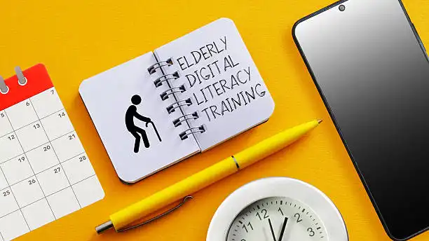
Colors are not a matter of personal taste; they are tools for psychological influence. In e-commerce applications, we use colors that inspire confidence or speed, while in meditation applications, we use colors that promote tranquility. In 2026, the focus will also be on "accessibility," ensuring that fonts are clear and colors are sufficiently contrasted so that everyone, including the elderly, can use the application effortlessly.
Choosing the right font (typography) plays a crucial role in how content is consumed. Eye-friendly fonts encourage users to read longer and remain within the application. If your application contains a lot of text, choosing the wrong contrast or a small font will inevitably lead to the user exiting within seconds. Always remember: the customer doesn't read, they scan the page with their eyes, so let colors and fonts guide them to the most important parts.

Personalization and Learning from User Behavior
The biggest secret to keeping users engaged with your app is making them feel it's "made just for them." With Smart UX in 2026, we adapt the interface based on customer behavior, displaying their favorite products on the home screen and reminding them of their previous searches. When a customer opens the app and finds what they're looking for right there, they'll perceive it as their "personal assistant," not just a store or tool.
Personalization also includes features like Dark Mode, which has become standard, and the ability to rearrange menus to suit individual needs. The goal is to create a "familiar environment," as people tend to stay where they feel comfortable and in control. The more a user can personalize the app, the harder it is for them to abandon it or switch to a competitor that requires them to start from scratch.