


When to use animation within your app
To illustrate the app's response after a user action
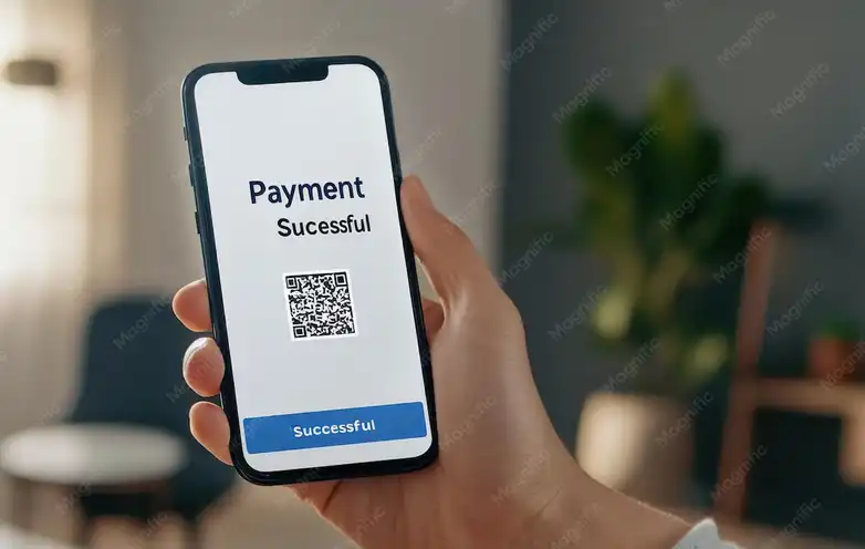
One of the best uses of animation is to confirm the user's action.
When the user presses the "Send" button, it's important to have a clear indication that something is happening.
For example, a rotating send icon or a "Sent Successful" effect.
These animations build trust and make the experience more meaningful.
Without these animations, the user might think the app hasn't responded and repeat the action.
This could lead to sending data more than once or feeling bored.
Simple animations, such as shaking on an error or expanding on a success, give a lively impression.
But don't overdo it with animations; keep them simple, clear, and non-distracting.
Using animations at these moments directly enhances the user experience.
They explain and confirm, without the need for long or confusing text messages.

When loading data to ease the user experience
Animations are very useful when there is a waiting time.
Instead of a blank or boring circular screen, use animations that give the impression of liveliness.
For example, when loading a product list, have the items appear gradually with a gentle hover.
This gives the impression that the app is active and working, even if it takes a little longer.
Animation reduces boredom and creates a smoother experience.
Skeleton animation or lazy loading are used here.
Sometimes a loading icon appears to move or change in cute shapes.
But beware of repetitive, heavy animations that affect performance.
Animations here are not for decoration, but rather for organization and calming the mind while waiting.
The calmer and more logical the animation, the better and more professional the experience.

To direct attention to important elements
Sometimes you need to draw the user's attention to a specific action or element.
This is where animation plays an important role in visual focus.
For example, when a new offer appears, the card might vibrate or glow for a few seconds.
Or when a new message arrives, the top bar might gently vibrate to draw attention.
These movements convey the message, "Pay attention, there's something new or important."
But they shouldn't be obtrusive or repetitive, or the user will lose interest.
The animation should be precisely directed and have a clear purpose.
It's best to stop the animation after the user sees it for the first time.
Using animations in this way supports visual orientation, not decoration.
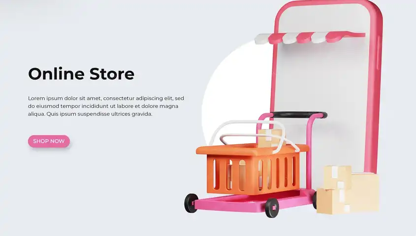
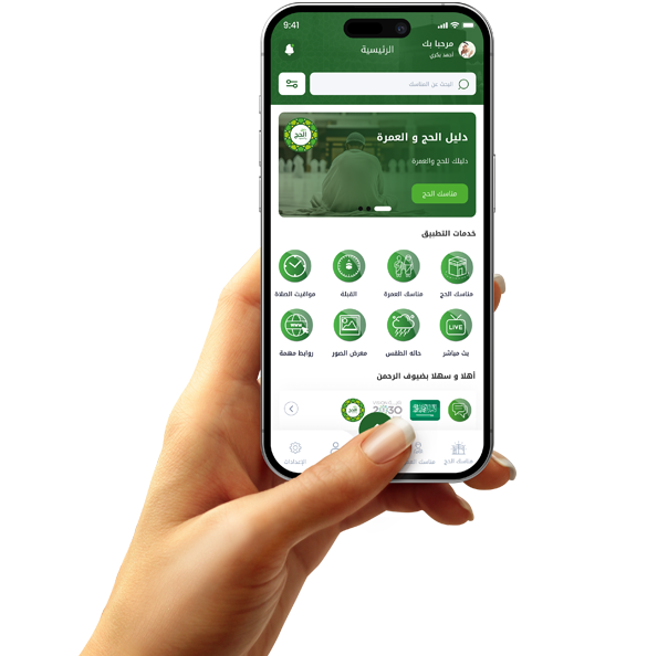
In commerce applications, for example, you can direct attention to newly added offers or products.
Smart animations make the interface more interactive and clear.
When Displaying System Messages and Notes
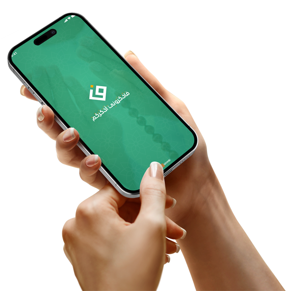
When in-app messages such as "Save Successfully" or "Error Occurred" appear, it's helpful to display them with animations.
The message appears as a fade-in or slide-out animation from the top of the screen, giving a professional feel.
The animations make the message more prominent without being obtrusive or overwhelming the content.
You can also use animated symbols such as a ✓ check mark that appear with the message to confirm success.
In the event of an error, it's preferable to use a slight vibration or a smooth red color.
The duration of the message and its animation should be specified (for example, 3 seconds).
Add the ability to manually close the message with a smooth slide-out animation.
The animations add clarity to the messages and enhance comprehension without requiring extended reading.
Avoid random or abrupt animations, and maintain a consistent style across all messages.
The animations here aim to make communication between the system and the user clearer and more fluid.