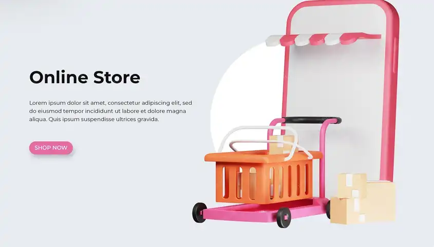


Ease of navigation in the app means increased sales.
One of the most important reasons for the failure of commercial applications is the neglect of the user experience.
Users don't want to learn how to use your application; they want to understand it immediately, interact with it easily, and reach their goal in the shortest possible time. This is precisely where the relationship between easy navigation and increased sales is born.
An application that makes navigating between sections clear and quick shortens the purchase time and reduces the chances of distraction. Think of major applications like Amazon or Noon, where you can find everything you need effortlessly, from the first suggested products to quick search and a simplified shopping cart. This design didn't come about by chance; it is the result of studies and experiments on user behavior.
In-app search, for example, when effective and fast, saves the customer valuable minutes and may be the direct reason for making a purchase decision. Complicated search, on the other hand, may push them to close the application and look for an easier alternative. This is where the loss begins.

Ease of navigation shortens the path between the user and the purchase decision.
Every second a user spends in an app searching for a product or navigating through menus either moves them closer to purchasing or further away. This is where the headline comes in: Ease of navigation shortens the path between the user and the purchase decision. It's not just about beautiful design, but also about efficient navigation and speed of access.
When everything is in its right place—from the category list to the product display and even accessing the shopping cart—the customer feels like they've known the app for a long time. This instant familiarity is often summed up in one word: ease. People tend to like what they understand quickly and trust what doesn't require much thought.

Less effort, more profit: Simple design wins
In the world of apps, users don't easily give themselves a second chance. If they're not satisfied within the first minute, they'll leave immediately. This is where the power of simple design and easy navigation comes into play. The less effort the user requires to interact with the app, the more immediate profit.
Imagine a user searching for a specific product and encounters difficulty accessing it due to complex sections or a poorly organized interface. The result will likely be that they leave the app without completing a single transaction. Conversely, if they find what they're looking for easily, in a matter of seconds, the likelihood of purchasing increases.
Ease of navigation reduces "buying resistance," the psychological barriers that prevent a customer from making a decision. A simple interface, clear menus, and fast loading speeds all encourage them to proceed without hesitation. It's as if the app is saying, "Don't worry, everything is easy and clear."

Every Click Counts: How Ease of Navigation Impacts the Purchase Decision
When an app is designed to facilitate access to products, users become more open to exploration. Instead of focusing on "how to get there," they focus on "what to buy." This mindset shift is the secret to successful app sales.
Ease of navigation creates a sense of control and comfort. The user feels like they're guiding the journey, not the app forcing a complex path. This simple sense of security can encourage them to make a purchase with greater confidence.
For example, clear product filtering or a logical breakdown of categories makes the search process enjoyable rather than stressful. Even large images and short descriptions add to the ease of decision-making, because each piece of information presented helps them quickly evaluate.