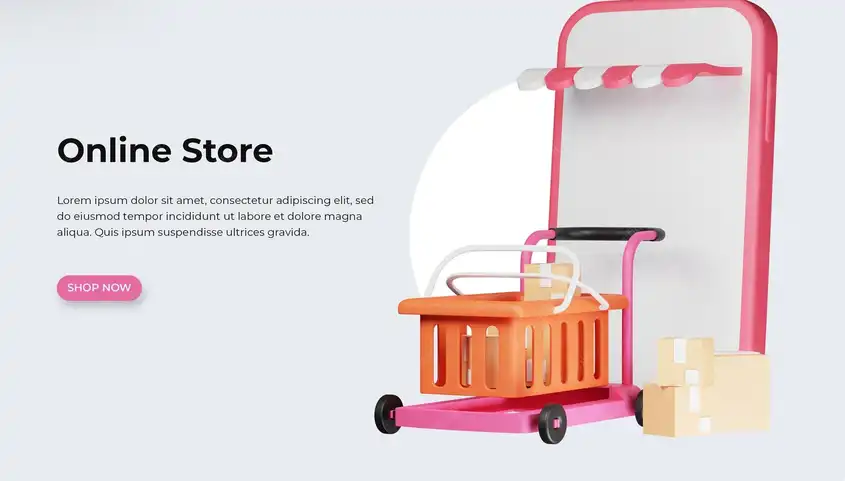


Design an application to sell used products
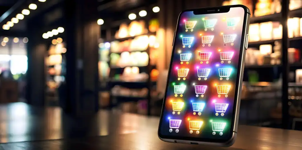
A trusted platform starts with professional product display options
In apps for selling used goods, the first image of a product can determine whether a user clicks or scrolls. Therefore, the design should focus on providing strong and attractive product display options. Start by allowing the user to upload multiple high-quality images, with the ability to zoom in and switch between them seamlessly.
Then comes the importance of the details: the product name, its condition (new, like new, lightly used), a precise description, and the price. All of these elements should be clearly visible without requiring the user to scroll too much.
Also, consider adding interactive design elements, such as "status tags" (e.g., negotiated, available, sold), to speed up user decisions and provide an instantly updated experience.
Smart design allows users to categorize their products when posting, such as electronics, furniture, or clothing, making them easier to find in search results.
When browsing products, make sure the user sees "product cards" organized within visual grids, displaying the image, address, price, and distance from their location.
You can also use simple icons to indicate the delivery status, whether the product is available for shipping or direct delivery, saving time for both parties.
The product page design itself should be informative but organized, so that no element overwhelms another.

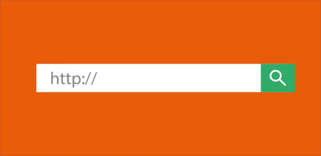
An intelligent search and filtering system is the true heart of the app.
The success of a used goods selling app is incomplete without an effective and fast search system. Users don't want to have to navigate through hundreds of products until they find what they want. Therefore, the design should focus on providing a search bar that is visible everywhere within the app, preferably always at the top.
Add a keyword search feature with auto-complete support to facilitate the user experience and save time.
But simply having a search is not enough; smart filtering is even more important. Here, a flexible filtering interface should be designed, allowing the user to select criteria such as category, price, distance, product condition, delivery method, and more.
Filter design should be clear and simple, with buttons that can be easily cancelled or modified.
Also, consider designing a "saved search," where the user can save a specific search and return to it later with a single click.
"Filter by location" using maps is one of the most powerful features of these apps. Designing an interactive map linked to the results adds a rich user experience and helps them compare nearby products.
Don't forget the importance of flexible design for misspelled words or abbreviations. Smart search should be able to tolerate simple spelling errors without displaying "No Results." Speed is key. The more instantaneous or within seconds search results appear, the higher the user engagement and satisfaction with the app.

User Account Page Design: The Starting Point for Every Successful Interaction
When a user enters the app, their personal account becomes the center of their management for all activities. Therefore, the account page should be designed in an organized, simple, and easy-to-use manner. Make it easily accessible from the bottom or sidebar so the user doesn't get lost while navigating.
Start by displaying their name and profile picture, if available, along with the option to quickly edit basic information such as email, phone number, and location.
When designing this page, you should consider three main sections: the Selling section, the Buying section, and Settings.
In the Selling section, the user should see a list of all their published products, along with their statuses: Listed, Sold, or Under Negotiation. Add edit or delete buttons for each product without having to navigate to other pages.
The Buying section displays their favorites, messages with sellers, and any agreed-upon orders. Organization here facilitates tracking purchases and encourages the user to complete transactions.
Settings should include controls over notifications, language, and alert types, giving the user a sense of complete control over their in-app experience.
Don't forget to design a section for reviews, whether the user has received or those written by others, which enhances mutual trust between the parties.
Also, add an "Activity History" where the user can see updates they've made, such as modifying a product or deleting an ad. This gives a sense of professionalism.
If an in-app e-wallet is available, the user's balance and transaction history should be clearly and organized.
Adding a Rating and Comment System to Build In-App Trust
In apps that sell used products, trust is a crucial factor in making a purchase decision. Therefore, a rating system should be an essential part of the app design, not just as a cosmetic element, but as a tool for building a trusted and engaged community.
Start by designing a simple interface that allows the user to complete a rating for the seller after each purchase or interaction. This rating includes a number of stars from 1 to 5, along with an optional text comment.
Make sure the rating interface is clear and doesn't consume the user's time, while encouraging them to leave a review with a short motivational message such as "Help others with your experience."
Each review should appear on the seller's page in an organized manner. Ideally, the average rating should be displayed at the top of the page, next to the total number of reviews.
It's also a good idea to display the most recent reviews first, with the ability to filter them by star count or by product type.
Also, make comments appear in thumbnails below each product, so users can see what others are saying before purchasing from the same seller.
In designing reviews, don't just use text; you can incorporate simple icons to quickly indicate whether the review is positive or negative.